




09 / 16
- Client
- Greenwold
- Sector
- Garden centres
- Year
- 2022
- Duration
- 20 weeks · 4 people
- Disciplines
- Identity, Website, Signage
Nine Kent garden centres, one family, and a sign for every week.

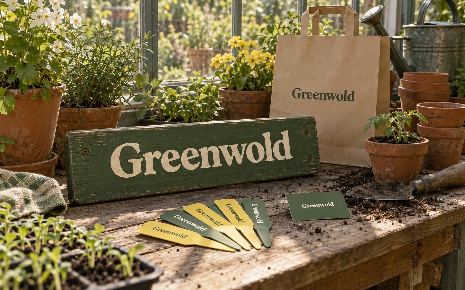
A garden changes every week. The signs had stayed the same for decades, so we made a brand that changes on Mondays.
The brief
Greenwold opened its first garden centre outside Paddock Wood in 1968. The third generation now runs nine across Kent, from Faversham to Tenterden, with 410 staff. Each centre had signs from a different decade, and the website listed opening hours and little else.
The national chains were cheaper on compost and pots. What Greenwold had, and they did not, was staff who knew what to plant this week in this soil. The brief was to make that knowledge visible on site, on labels and online, before the spring.
The idea
The brand is built on the gardening week. Every centre has a board at the entrance saying what to sow, plant and prune now, changed by staff every Monday from a printed kit. The website shows the same list, and what is in flower and in stock at your nearest centre.
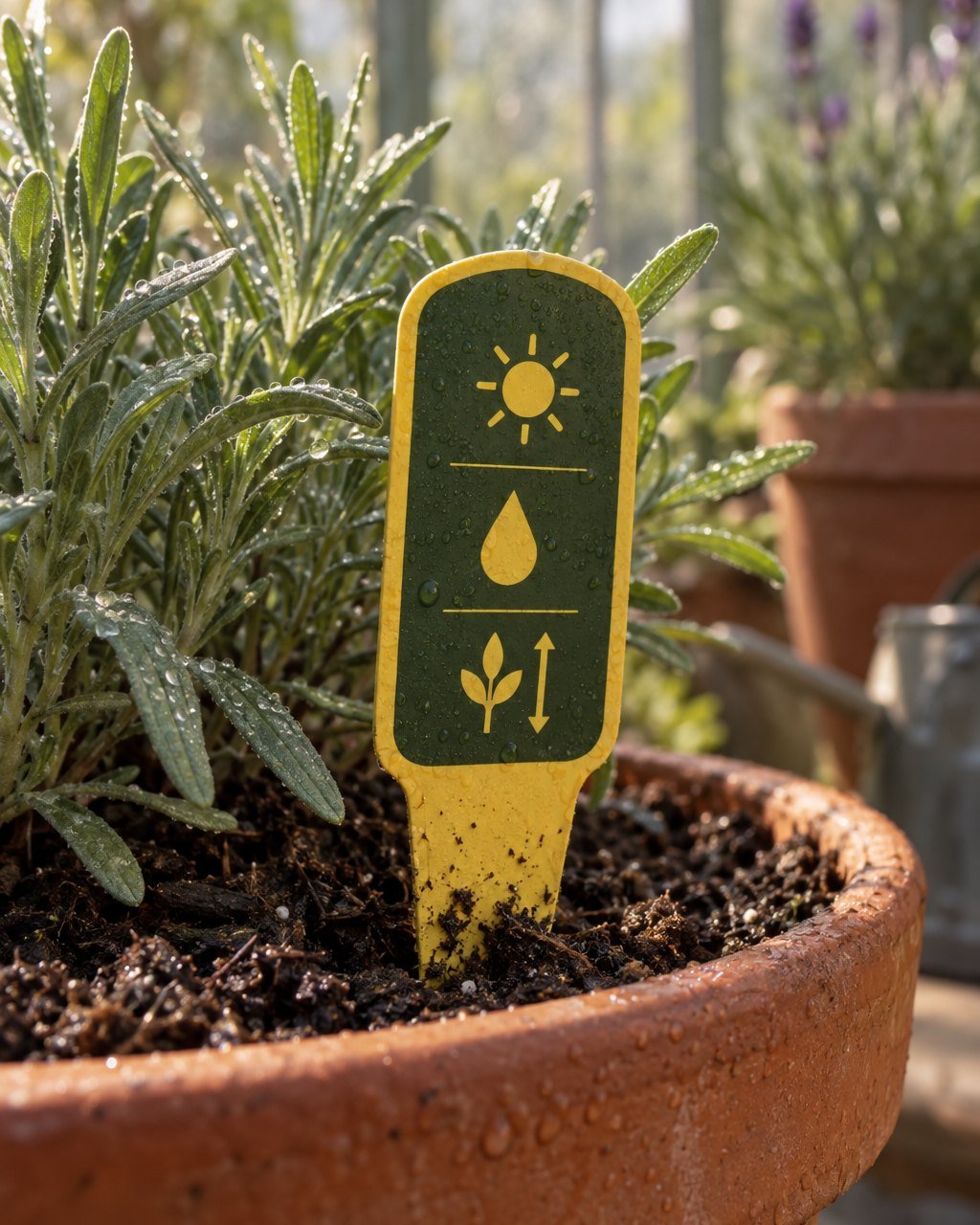
Around it, one system for everything else: a sturdy grotesk, moss green and a seed-packet yellow, plant labels that answer three questions in symbols, and a Garden Club card that moved from paper stamps to a number on your phone.
What we made
- Identity and wordmark
- Signage for nine centres, inside and out
- Weekly entrance boards and staff kit
- Plant label system
- Website with stock by centre, designed and built
- Garden Club card and sign-up
Three questions, read from a crouch
Sun, water and final size, in symbols large enough to read at the height of a bench. Twelve thousand labels were replaced over one winter, printed on recycled board that lasts a season outdoors.
How the mark moves
Each letter turns like a seed packet flipped over to read the back, a beat behind the one before. It runs on the screens by every till.
What changed
Garden Club members, up from 9,400
Eighteen months after launch. Most sign up at the till in under a minute.
spend per visit in the first spring
Across all nine centres, with the same opening hours and staffing as the spring before.
centres re-signed in eleven weeks
Installed between November and January, without closing a centre for a day.
Who made it
Orvel
 Anjali RaoCreative directionLondon
 Tomás FerreiraIdentity and signageLisbon
 Freya LundStrategy and websiteLondon
With
- Client team
- Sarah Greenwold, Mark Greenwold, Dee Akintola
- Signage
- Weald Sign Works, Ashford
- Plant labels
- Medway Label Co.
- Photography
- Hattie Lowe
- Website development
- Orvel engineering