




01 / 16
- Client
- Kinro
- Sector
- Payments app
- Year
- 2026
- Duration
- 16 weeks · 4 people
- Disciplines
- Identity, App, Launch film
A payments app for 400,000 freelancers, rebuilt around money that arrives on time.
Freelancers don’t want a bank. They want to stop chasing. So every screen answers one question: has it arrived?
The brief
Kinro began in 2021 as Paydue, an invoicing tool for designers and developers. By 2025 it held accounts, instant payouts and tax pots for 400,000 freelancers, and still looked like a spreadsheet with a logo.
The old name was already registered in four of the six markets on the roadmap. With a Series B closing and a launch in Germany and the Netherlands booked for spring, the team needed a name, an identity, a redesigned app and a launch film in sixteen weeks.
The idea
We interviewed forty freelancers. None of them talked about banking. They talked about the week a client paid late and the rent went out anyway. The brand is built on the opposite moment: the second a payment lands.
Kinro is two syllables with no meaning in the eleven languages we checked, and a round, closed shape that holds up on a 29-pixel app icon.
What we made
- Naming and trademark screening
- Identity and motion system
- Voice guidelines and notification library
- App redesign: onboarding, invoices, payouts
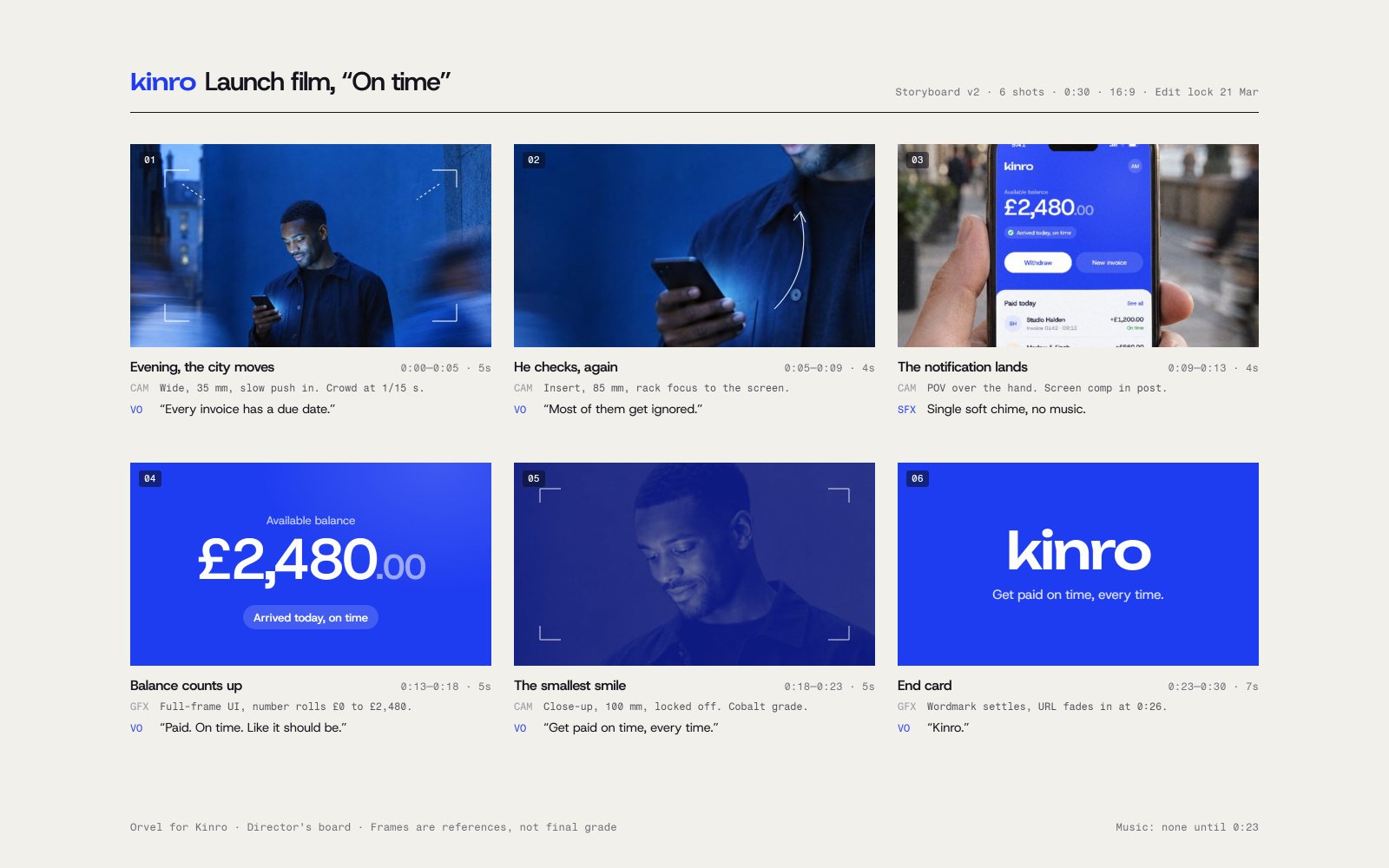
- 60-second launch film and six cut-downs
Four hundred names, one left
Eight names reached the final round. Each had to pass four tests, in this order, before anyone was allowed to like it.
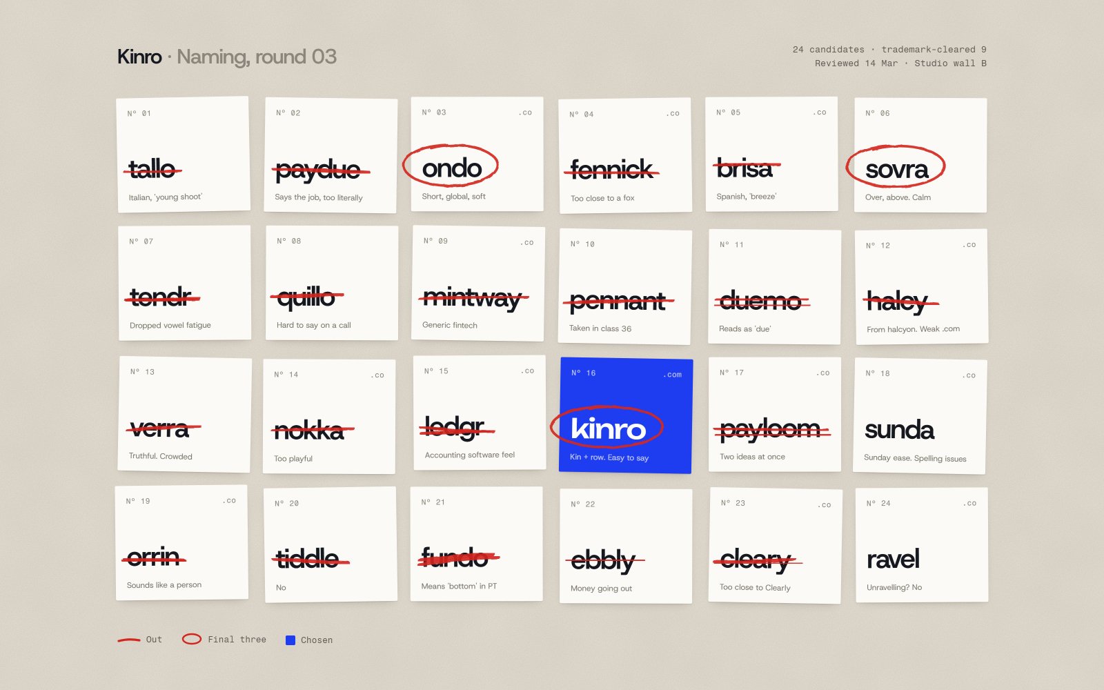
- OndoOut: Registered in Germany and Spain
- PayloomOut: Reads as a pun only in English
- RavelOut: Registered in four markets
- KinroPassed all four
- BrisaOut: A Portuguese motorway operator
- FennickOut: No usable domain under £40k
- SovraOut: The v closes up at icon size
- DuemoOut: Domain held by a parked portfolio
The tests, in order: Trademark clear in six markets; Says itself in eleven languages; Short domain available; Holds at 29 pixels. Kinro passed all of them.
How the mark moves
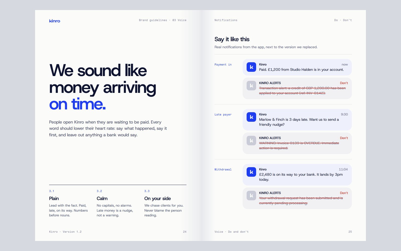
The wordmark lands like a payment: letters drop in, overshoot once and settle. The same curve runs on every amount that counts up in the app.
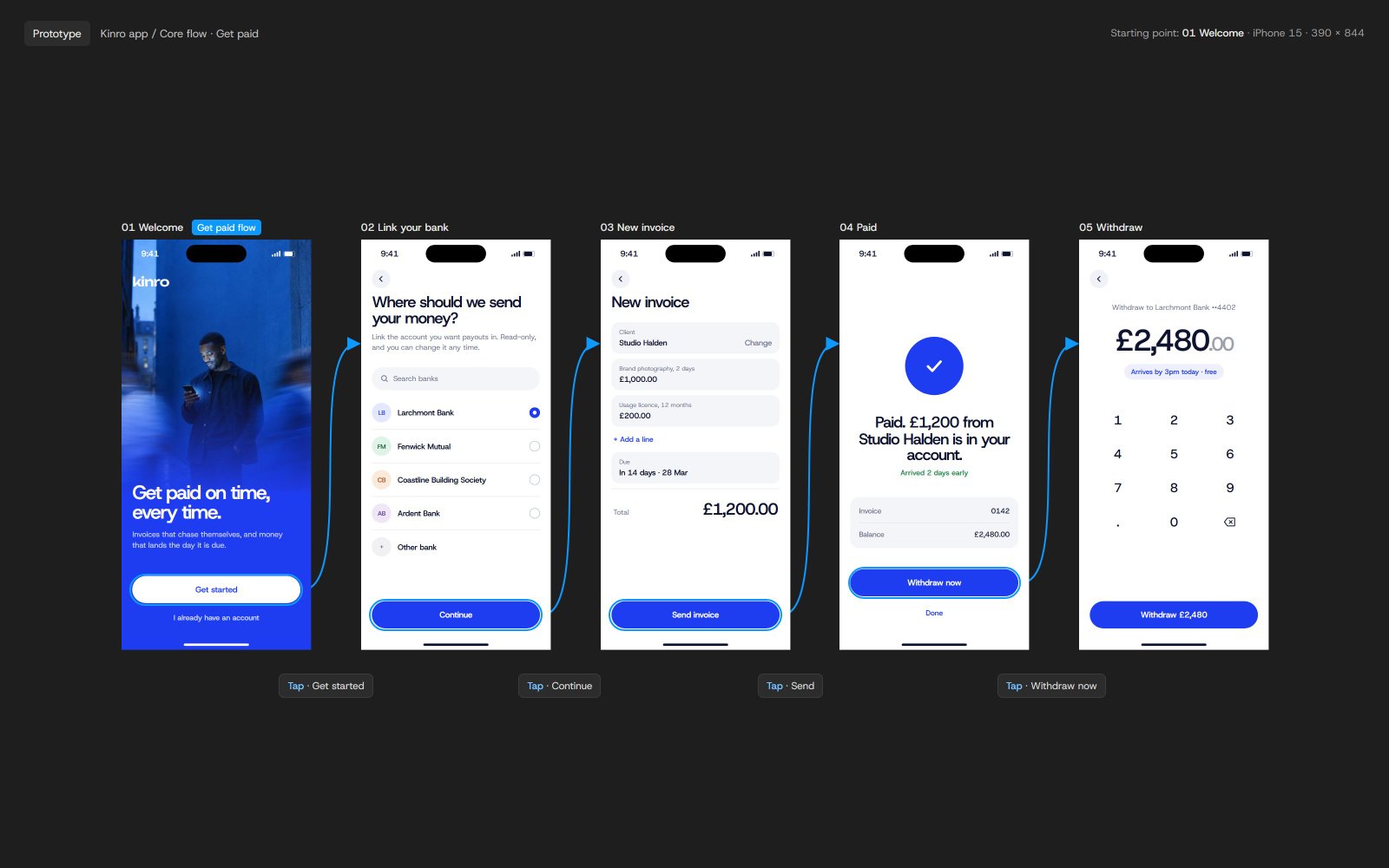
The balance comes first
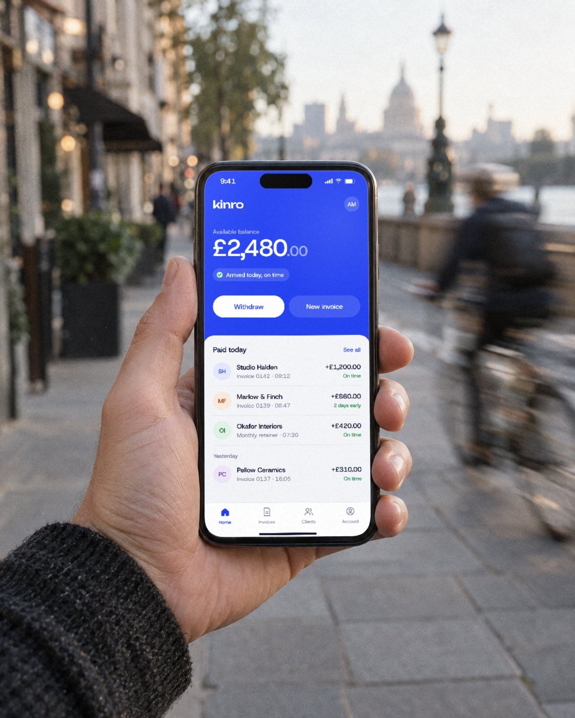
The home screen shows one number and what is on its way. Everything else is a tap away. In testing, freelancers found their next payout in under two seconds.
What changed
sign-ups in the quarter after relaunch
Measured against the same quarter a year earlier, with paid acquisition held flat.
app store rating, up from 4.1
Reviews now mention speed and clarity, not missing features.
support tickets about payment status
Notifications say who paid, how much and when, in that order.
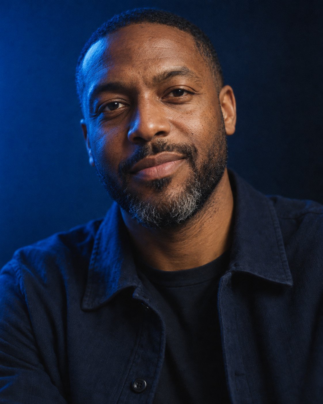
Orvel made us look like the company we were about to become. Our investors noticed before our customers did, and then our customers noticed too.
Who made it
Orvel
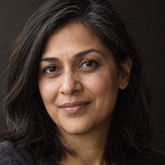 Anjali RaoCreative directionLondon
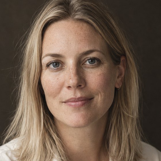 Freya LundStrategy and namingLondon
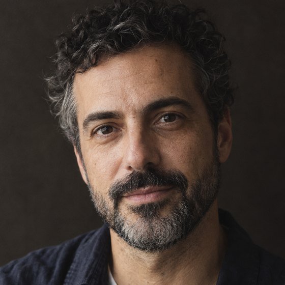 Tomás FerreiraProduct designLisbon
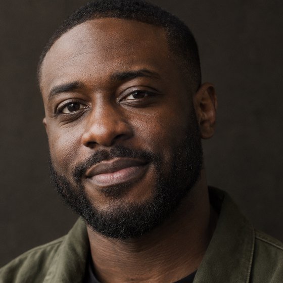 Kayode AdebayoLaunch filmLondon
With
- Client team
- Daniel Osei, Leah Brandt, Joost van Rijn
- Film
- Kayode Adebayo (director), Ruth Achterberg (camera), Sam Ilori (grade)
- Music
- Tove Hallin
- Trademark counsel
- Marsh & Quill LLP