





Accessibility belongs in the brief
Treated as a final check, accessibility becomes a list of fixes nobody budgeted for. Written into the first page of the brief, it shapes the colours, the type and the product from week one.
 Freya LundStrategy Director, London
- Kind
- Product
- Published
- Reading
- 3 min
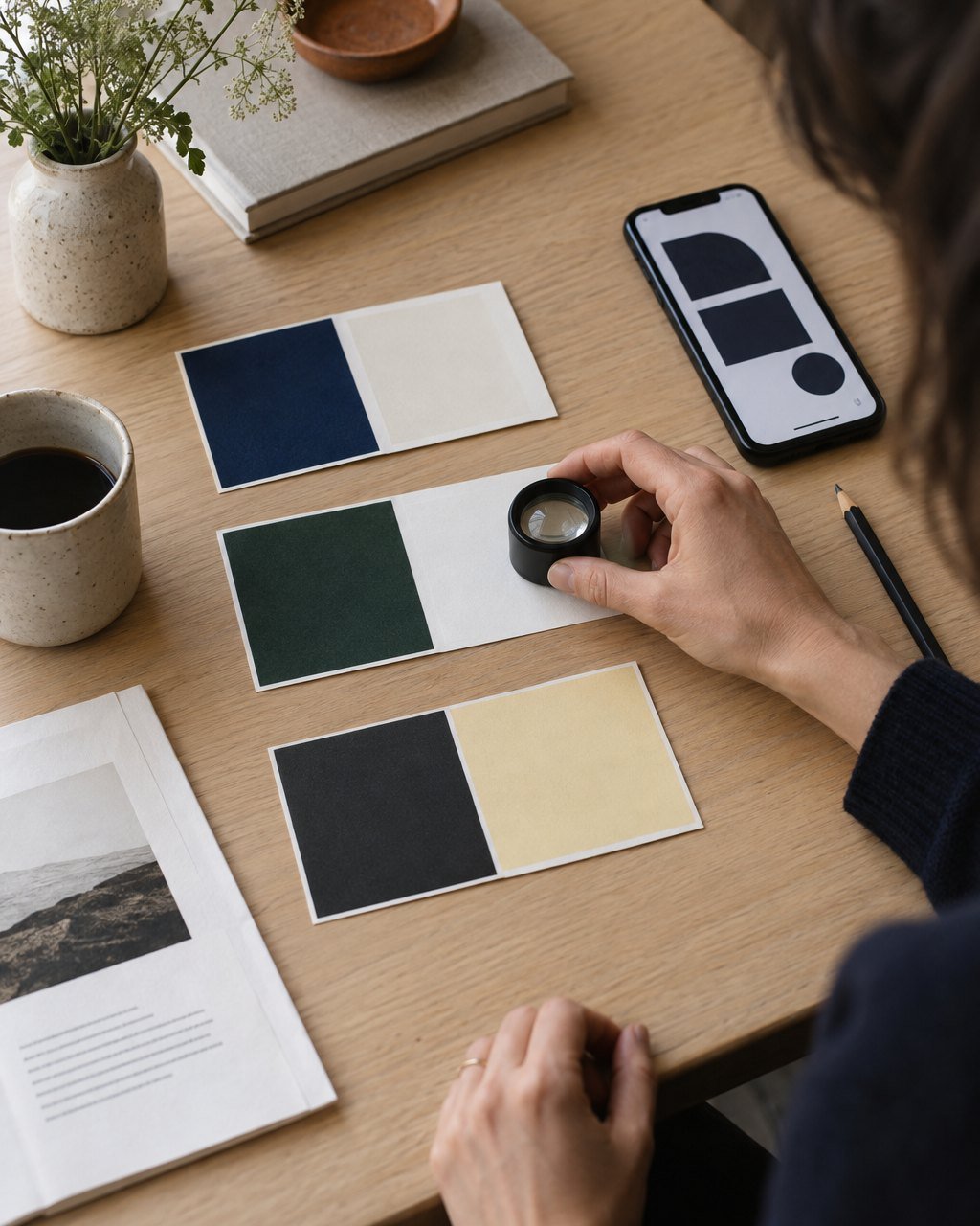
For years our briefs had a line near the bottom saying something like “the site should meet accessibility standards”. Everybody agreed with it, nobody priced it, and it was usually tested in the last fortnight, when a developer ran an automated checker and found sixty problems that had been designed in three months earlier. Contrast that failed by a whisker, form errors shown only in red, a carousel that could not be paused, a menu that trapped keyboard users. Each fix was small. Together they cost a week nobody had planned, and the site that launched was a patched version of the one that had been approved.
Since the start of this year, accessibility goes on the first page of every brief we write, with the same weight as the audience and the budget. That line now holds four commitments, each written as a number.
- The standard we are building to, named and versioned: WCAG 2.1 at level AA, unless the client’s sector asks for more.
- Contrast targets set before any colour is chosen: 4.5:1 for body text, 3:1 for large type and interface controls.
- A minimum body size of 16 pixels on screen and a minimum touch target of 44 by 44 pixels.
- Every interaction usable with a keyboard alone and announced properly by a screen reader, checked by a person, not only by a tool.
Writing them as numbers is the point. “Accessible” invites a debate about good intentions. “4.5:1” can be checked by anyone with a free contrast tool, including the client, and it turns a moral argument into a design constraint, which designers are good at working with.
What changes in the design
Constraints set early change the work in useful ways. When contrast targets exist before the palette does, we stop choosing a lovely pale grey and then darkening it until it scrapes through; we choose colours that pass and make them lovely. The brief can also describe the conditions people will be in. For Ouvi, the medical interpreting app we are designing this spring, it names them plainly: a hospital corridor, one hand holding a phone, often anxious, sometimes reading in a second language. That one sentence has done more for the interface than any checklist. It argues for large controls, plain words and layouts that still work at 200 per cent text size, because the people who need an interpreter fastest are rarely having a calm day.
An audit in week twelve tells you what is wrong. A line in the brief stops it being built.
Three passes, not one
We now test in three passes rather than one: the palette and type scale in week five, interactive prototypes with a keyboard and a screen reader in week eight, and the built product with two or three people who use assistive technology every day, paid for their time, before launch. The last pass always finds something the first two missed. On a recent site it was a date picker that worked perfectly with a mouse and took a screen reader user four minutes to get past.
The cost conversation
Clients reasonably ask what this adds. On a website it is about three to five per cent of the build, most of it testing. Fixing the same problems after launch costs several times that, and some of them, like a palette that fails contrast, cannot be fixed without reopening the identity. Nor is the audience a small group to be accommodated at the end. It includes anyone with tired eyes, a cracked screen, an arm in a sling or a phone in bright sunshine, which at some point is all of us.