





The case for fewer typefaces
Most brands we audit use four or five typefaces. Most identities we make use one, sometimes two. On what a second face has to earn.
 Tomás FerreiraDesign Director, Lisbon
- Kind
- Craft
- Published
- Reading
- 3 min
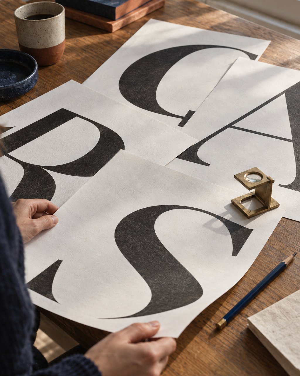
In the two-week audits we run before redesigning anything, we count the typefaces a company actually uses. Not the ones in the guidelines: the ones on the website, the app, the invoices, the delivery notes and the slide template. The median across our last twenty audits is five. The guidelines usually specify two. Most of the identities we have made in the last few years use one family, sometimes two. This is not minimalism for its own sake. It is the most reliable way we know to make a brand look like itself in places we will never see.
Where the extra faces come from
Nobody sets out to use five typefaces. They arrive one sensible decision at a time. A display face for the launch. A different one in the app, because the first did not have enough weights. A system font in the emails, because the custom one would not render. A free one in the slides, because nobody had the licence installed. A condensed face for a single campaign that never quite left. Each decision was reasonable. Together they make a brand that sounds like five people talking at once.
What one family can do
A good family with a full range of weights, an italic and well-drawn figures can do almost everything an identity needs. Hierarchy comes from size, weight and space. Personality comes from how you set it: tight or open, large or small, how much room it is given. Corso’s app and its hub signage use a single family in three weights, and nobody who rides one of its bikes has asked for more.
- One family is simpler to license, for every place it is used, in the client’s own name.
- It loads faster. On Greenwold’s website, moving from three families to one took about 140 kilobytes off the first page load.
- It survives other people. An in-house team or a new agency cannot drift far with one family. They can drift a long way with four.
- It makes every decision visible, so weak layouts are noticed early rather than disguised by a change of face.
A second typeface has to do a job the first cannot. Wanting variety is not a job.
When a second face earns its place
We do use two typefaces, about a third of the time. The second has to do a job the first cannot, and we write that job down in the guidelines, so that nobody adds a third later in its name. For Clausa, contract software for small law firms, the second face is a monospaced one used only for clause numbers and document references, where alignment matters more than voice. For Halyard Press, an independent publisher, the second is a text face for long reading, because the display family that made the covers was tiring over three hundred pages. In both cases the rule fits on one line.
A second face does not earn its place because the first feels plain in a presentation, or because a new campaign wants to look different. Those are reasons to set the face you already have more boldly.
Ask for fewer
If you are commissioning an identity, ask how many typefaces it uses and what each one is for. If the answer for any of them is “variety”, or a pause, that one will probably cost you more than it gives. And when you audit your own, start with the slide template. That is usually where the fifth one is hiding.