



Packaging that photographs well
Most customers now see a product on a phone long before they hold it. So we design a pack for the thumbnail, the flat lay and the shaky kitchen photo, and only then for the shelf.
 Freya LundStrategy Director, London
- Kind
- Craft
- Published
- Reading
- 3 min
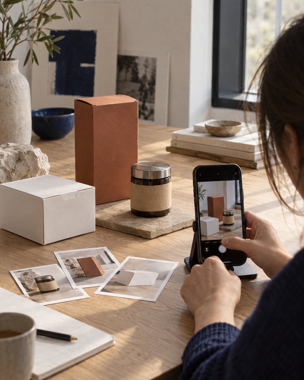
When we designed packaging for Hollin, the candle maker, in 2020, the shops were shut for much of the launch year. Hardly anyone picked a jar up, smelled it or turned it over before buying. They saw it as a square image about three centimetres wide on a phone, then in another customer’s photograph, and only then on their own windowsill. That year changed how we think about packaging, and it has not changed back now the shops have reopened.
Design for the thumbnail first
The first test we run on any pack is the smallest. We drop the design into a product grid at 120 pixels wide, beside eleven competitors photographed the way retailers photograph them, and look at it on a phone at arm’s length. Fine detail disappears. Thin type turns grey. A pale pack on a white background vanishes entirely, which matters because most online shops shoot on white. What survives is the silhouette, one block of colour and perhaps one word. If a customer cannot pick the product out of that grid in a second, no amount of beautiful finishing will help it.
Five things that photograph badly
- Gloss and mirror foils, which turn into white glare under a ring light or a window and into black holes in shade.
- Clear windows and transparent labels, which take on the colour of whatever happens to be behind them.
- Very dark packs with dark type, which a phone’s automatic exposure flattens into a single shape.
- Fine reversed-out text below about seven point, which fills in on screen just as it does on press.
- Front panels crowded with claims, which read as noise at any size smaller than the hand.
None of these is banned outright. A brushed, matt metal photographs warmly where a mirror foil flares, and a dark pack works if the type is large and the edges are clean. But each one has to be tested in a photograph, not just on a print proof, before it is approved, because the difference only shows up on camera.
Photograph the prototypes, badly
Our prototype reviews now include a photography session that would horrify a product photographer. We take the mock-ups home and put them on a kitchen counter, a bathroom shelf, a bedside table, then shoot them on whatever phone we have, in morning light and under a ceiling bulb at night. Those are the pictures customers will actually take and share. We pin forty or fifty of them on the wall next to the polished renders, and it is the quickest way we know to see whether a pack keeps its character outside perfect conditions. We also brief the photographer in the same week as the structural designer, so the brand’s photography and its packaging are solved together rather than one after the other.
If a pack only works in the hand, it was designed for the last moment a customer meets it, not the first.
The shelf still matters
A pack still has to stand up, open easily, survive a courier and tell a shop assistant what it is. We simply no longer start there. We start with the moment most customers first see a product, small, on a phone, beside its competitors, and make sure it wins that moment. The shelf, the unboxing and the windowsill are then about keeping the promise the photograph made.