
Booking flows guests actually finish
Casa Mareta’s direct bookings went from 22 to 58 per cent. Most of the gain came from three screens and one honest sentence about price.
 Anjali RaoFounder, Creative Director, London
- Kind
- Case note
- Published
- Reading
- 3 min
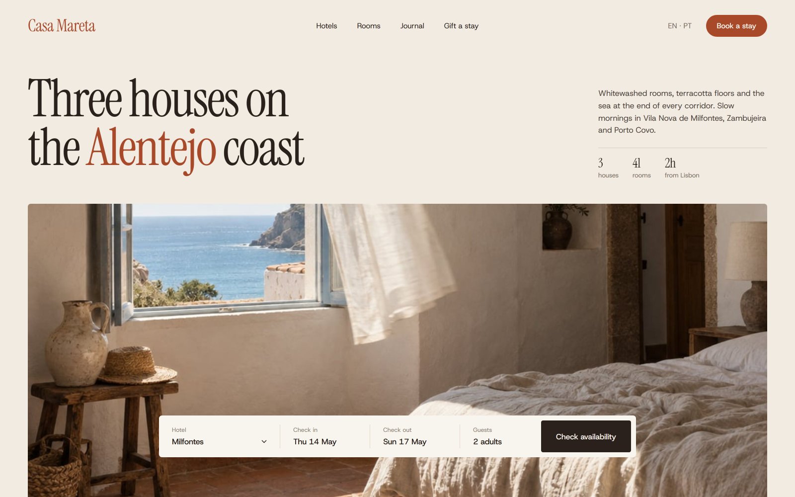
When we started working with Casa Mareta, its three houses on the Alentejo coast each had their own booking engine, and between them they kept 34 per cent of the guests who started a booking. Two in three gave up before paying, and many of those went on to book the same room through a travel agency at up to 18 per cent commission. Only 22 per cent of rooms were booked direct.
The new site went live in January. Of the rooms booked so far for this summer, 58 per cent came direct, and 71 per cent of guests who start a booking now finish it. Most of that came from three screens and one sentence.
Where guests were leaving
We spent the first week of the project at the houses, mostly in the kitchens and at the front desks, and then watched recordings of the old booking flow with Inês Valadares and Rui Calado. The drop-off was not where anyone expected. Guests were patient with the dates and the room choice. They left at the payment step, and when we asked six of them why, five gave the same answer: the price went up. The old engine showed a nightly rate without tourist tax, cleaning or the breakfast most guests assumed was included. By the payment screen a three-night stay had grown by around 14 per cent. Nobody was hiding anything, but it felt as if they were, and a guest who feels misled does not argue. They open another tab.
Guests do not abandon a booking because it is long. They abandon it the moment the price changes.
Three screens
- Dates and house. One bar for all three houses, so a guest who finds Milfontes full is shown Zambujeira and Porto Covo for the same nights, with the drive time between them.
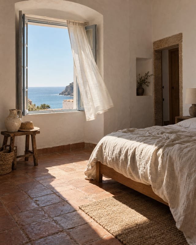
- Room. Each one photographed at the hour guests use it, with the full price for the whole stay on every card, tax and breakfast included.
- Details and payment. Name, email, card and nothing we do not need before arrival. Requests for cots or a late check-in are asked for by email a week before the stay.
The middle screen did the most work. Showing the total for the stay rather than a nightly rate makes every room look more expensive at first glance, and the owners were nervous about it. But the number never changes after that, and that turned out to matter far more than the first impression.
The sentence
Under every price there is a single line: “This is the price you pay. Tax and breakfast are included, and nothing is added at the end.” We wrote eleven versions of it. The final one is the plainest, and in testing it was the line guests quoted back to us most often. Direct rates are also the same as the agencies’ or lower, and the site says so in a quiet sentence beside the booking bar rather than in a banner. People who have been caught out by hotel websites before look for that, and they find it.
Built alongside the design
Our Lisbon engineers built the site next to the designers, and the booking flow ran against real availability from week nine, so we could test it with guests who were genuinely trying to book. That caught two problems no prototype would have: a calendar that loaded slowly on hotel wifi, and a card form that rejected Portuguese postcodes typed with a space. On this summer’s bookings alone, the commission the houses no longer pay looks set to cover the cost of the project more than once. The lesson we now take into every booking flow is simple: show the real price first, and never change it.