




Writing the button before the page
We write the words on buttons, errors and confirmations before we design the screens around them. The small words are where a product keeps or breaks its promises.
 Freya LundStrategy Director, London
- Kind
- Product
- Published
- Reading
- 3 min
On most product projects the words arrive last. Designers draw screens with grey bars where the text will go, engineers build them, and a week before release somebody is asked to fill in the copy. The words then have to squeeze into boxes designed for other words, and every awkward label, vague error and cheerful confirmation in the finished product can be traced back to that order of work.
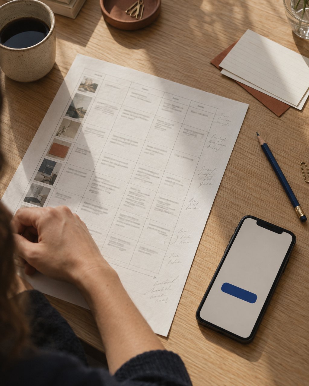
We work the other way round. On every product project, the first design artefact is a spreadsheet, not a screen. It lists every action a person can take and, for each one, the label on the button, the message if it fails and the confirmation when it succeeds. Only when that list is agreed do we start drawing.
Why the small words come first
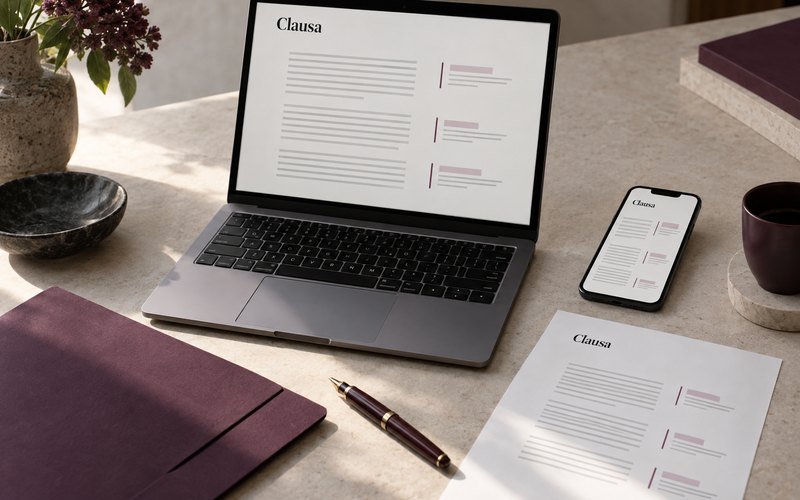
Buttons, errors and confirmations are where a product makes its promises. “Pay now” promises that money leaves your account immediately; “Send contract” promises that someone else receives something. If the word is wrong, no amount of good layout fixes it. Writing them first also exposes product decisions nobody has made, because you cannot label a button until you know exactly what it does. On Clausa, the contract software for small law firms, agreeing the label for the button that sends a contract to the other side took three meetings, because the team turned out to disagree about whether sending also locked the document. Better to find that out in a spreadsheet than in user testing.
Nobody reads a product. They read the button they are about to press.
Our rules for action words
- A button says what happens, as a verb and an object: “Send contract”, not “Submit” or “Continue”.
- One action, one word, everywhere. If it is “Remove” in one place it is never “Delete” in another, unless the two do different things.
- Errors say what went wrong and what to do next, in that order, and never blame the person: “That card has expired. Try another card.”
- Confirmations say what happened and what happens next: “Contract sent. We will email you when it is signed.”
- No exclamation marks on anything involving money, health or the law.
The spreadsheet as a design tool
The spreadsheet becomes one of the most useful documents in the project. Each row is a single action, with columns for the label, the success message, every error message, where it appears and who approved the wording. A product of moderate size has between 150 and 400 rows. Engineers like it because it is a list of states to build. Support teams like it because they can see in advance exactly what customers will be told. And it becomes the base of the product’s voice guidelines, which are far easier to write from three hundred real examples than from five adjectives.
What it does to the design
Designing around real words makes better screens. Buttons are sized for the longest label in the longest supported language, not for the word “OK”. Error states get designed properly, because they exist in the spreadsheet before they exist in the design file. And pages tend to get shorter, since once the action is clear, much of the explanation around it turns out to be unnecessary. Write the button first and the page rarely writes itself, but it almost always needs fewer words than anyone expected.