




Colour that survives a phone screen
A brand colour is approved on a calibrated monitor and lived with on a cracked phone at full brightness. How we test colour where people actually see it.
 Kayode AdebayoMotion Lead, London
- Kind
- Craft
- Published
- Reading
- 3 min
A brand colour is usually chosen on a calibrated monitor in a dim room, signed off as a printed chip under daylight bulbs, and then lived with almost entirely on phones: at full brightness on a bus, in night mode at midnight, through a scratched screen protector, after a social platform has compressed it twice. The chip and the colour people meet are rarely the same, and nobody is to blame for the gap unless nobody planned for it. In the motion team we meet the problem first, because video is where colour gets mistreated most. So we have taken over colour testing for every identity in the studio, and it now starts in week five, the same week we storyboard the mark.
The shelf of phones
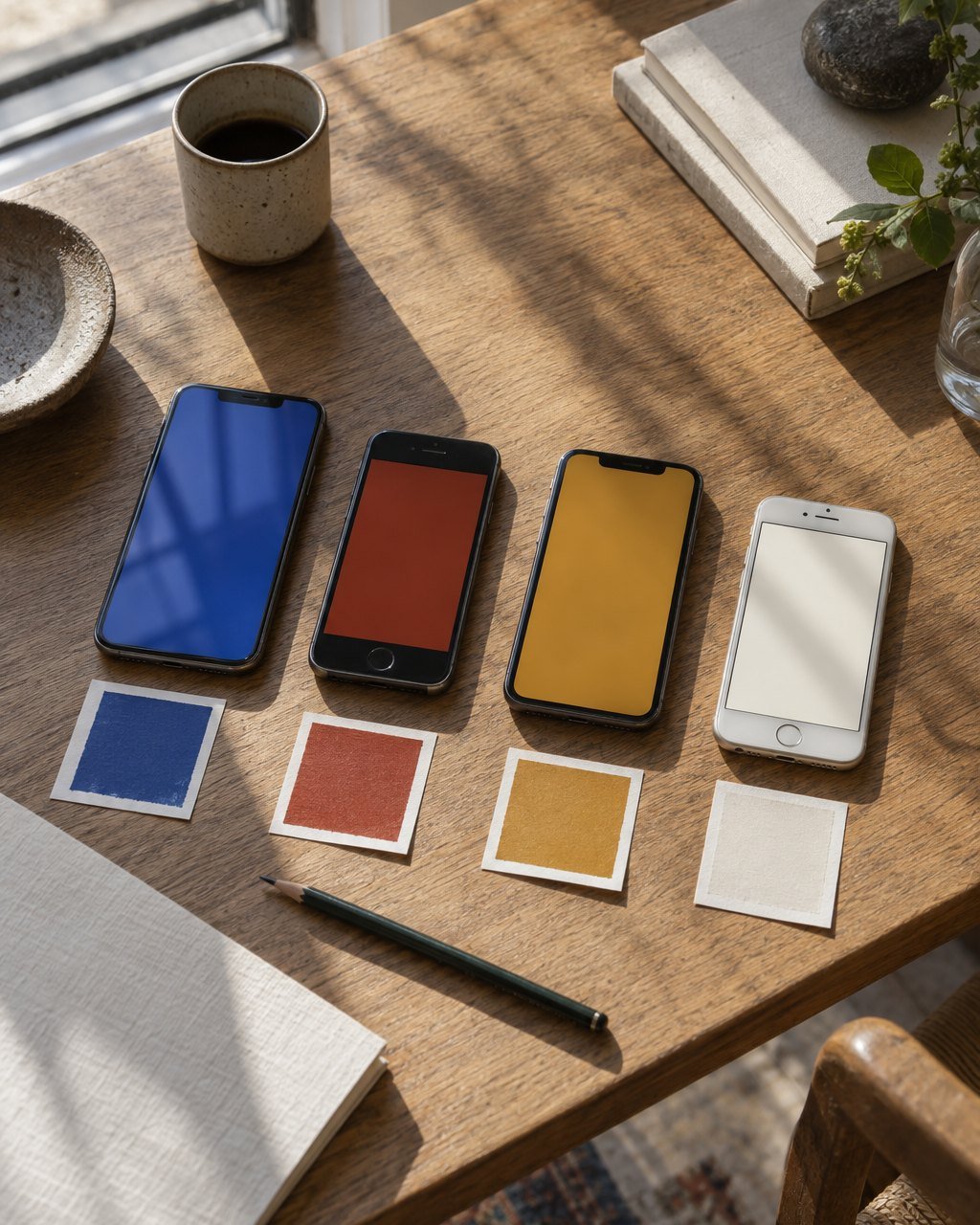
We keep fourteen phones on a shelf in the London edit suite. Four are new and expensive, six are two to four years old and mid-range, and four are the kind of handset people keep for six years. Between them they cover the screens that matter: bright OLED panels that push saturated colours further than they were meant to go, older LCDs that wash them out, and displays that warm everything up in the evening.
Every candidate colour goes onto all fourteen as a full-screen fill, as a button on a white page and on a black one, as a line of small text, and as the background of a short clip that has been through a social upload and back. We look at each at full brightness and at a third, indoors and on the roof.
What usually fails
- Saturated reds. On bright OLED screens they clip and lose their depth; after video compression they bleed into neighbouring pixels and soften any type set on them.
- Deep blues used for text. Beautiful as a chip, often impossible to tell from black at small sizes in sunlight.
- Pale tints. A background two per cent off white disappears completely on half the shelf.
- Colours that rely on a neighbour. A warm grey that looks considered beside cream turns green beside a photograph of grass.
Kinro’s cobalt
Kinro’s blue went through eleven versions before it was fixed. The first, picked in a type review, was a deep ultramarine that looked rich on the studio monitor and nearly black on the older phones. The next few were brighter and started to vibrate against white on the OLED screens, worst of all as the full-screen fill that appears when a payment lands. We settled on a cobalt that sits slightly greener than the eye expects on a monitor, because most phones pull it back towards the blue we wanted.
Nobody sees your brand colour on the monitor where it was approved.
The same test rescued Noturna’s red. It was matched to the stage gels and looked perfect in print. In the trailer, after compression, the type on it fuzzed at the edges. We kept the printed red and made a second, slightly darker and less saturated, for video only. Nobody watching notices that there are two.
Write the screen values down
Colour guidelines used to give one value per medium: a print reference, a process mix, a hex for screen. Ours now give three for screen. The core value; a version for video and large fills on bright displays; and a version for text, on light and dark backgrounds, that passes contrast checks at small sizes. Each comes with a short note saying where it was tested and on what. It adds about three days to an identity project. In return, the colour a client approved is the colour their customers see, on the phone in their hand, at whatever brightness they happen to have left it.