

Wayfinding for a museum of print
Forty-one signs, two languages and the museum’s own presses. Why Casa da Estampa prints its wayfinding, and reprints it every season.
 Tomás FerreiraDesign Director, Lisbon
- Kind
- Case note
- Published
- Reading
- 3 min
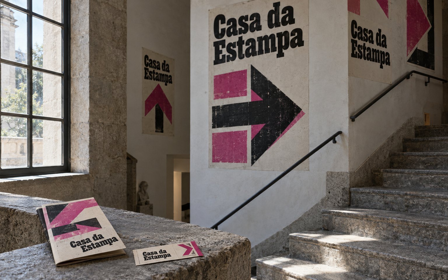
Casa da Estampa occupies a former printing works in Bonfim that made labels for the port lodges for ninety years. When the foundation asked us for a wayfinding system in 2018, they sent a floor plan, a budget and a catalogue of aluminium sign systems. We put the catalogue to one side on the first day. The building is three floors of workshops joined by doors knocked through as the business grew. There are two staircases, five changes of level and no obvious route. It needed signs that were clear for a school group of thirty and for a visitor who reads neither Portuguese nor English with ease. It also seemed wrong for a museum of print to buy its signs from someone else.
Print the signs on the presses
The museum has eleven working presses and two printers who give demonstrations every day. So the proposal was simple. Every sign is a letterpress poster, set by hand from the wood type in the collection, printed in magenta and black on heavy uncoated card and pasted to the wall. Nothing is screwed into the building, which is listed, and nothing is printed anywhere else. The foundation’s first question was durability. Card on a wall does not last like enamel. We agreed that it did not need to. The signs are reprinted with each new exhibition, roughly three times a year, so wear never builds up and the wayfinding changes with the programme.
A sign printed in the building tells you where you are in more ways than one.
Rules for type you cannot scale
Designing with wood type changes how you work. You cannot set a heading at 212 points because it suits the wall; you have the sizes in the cases and nothing else. We catalogued the collection in the first fortnight and built the system around what was there.
- Three sizes only: the largest for floors and rooms, a middle size for directions, the smallest for the second language.
- Portuguese in black, English in magenta, always in that order and in the same place on the sheet.
- Arrows printed from a set of wood-type arrows found in a drawer on the second floor, in six directions.
- Magenta means up, black means down. School groups learned it within one floor.
- No sign carries more than three destinations.
Some of the limits were awkward. The middle size has only four lower-case g, which ruled out two gallery names until the curators changed them. We would never have written that rule ourselves. It made the signs better.
Testing on the stairs
Before anything was printed we pasted up photocopies and walked the building with three groups: a primary school class, a tour party from a cruise ship and four members of the foundation’s board. We followed each group with a floor plan and marked every hesitation. Most of the trouble was at the second staircase, where one door opens onto two possible routes. The fix was a single arrow on the landing, printed from the largest block in the collection. The full set of 41 signs takes the printers three days. They print it in public, during demonstration hours, so visitors watch the wayfinding being made before they follow it.
What it came to
The museum opened in February 2019 and welcomed 96,400 visitors in its first twelve months, against a forecast of 60,000. We cannot claim the signs for that. We can say that the front desk stopped handing out paper maps in the second month, and that retired signs, numbered and signed by the printers, became one of the shop’s steadiest sellers. In the first two years they raised €31,000. For us the lesson was about materials. The best wayfinding we have made was decided by what was already in the building: the presses, the type and two people who knew how to use them.