


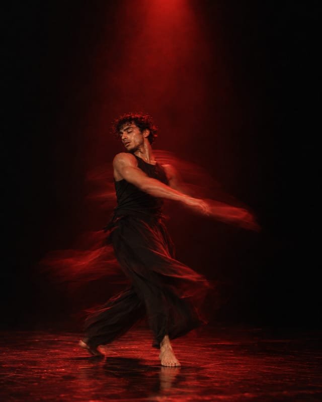


A logo is a behaviour, not a drawing
We storyboard a mark before we finalise it. If it cannot turn, split and settle on a phone screen, it is not finished.
 Kayode AdebayoMotion Lead, London
- Kind
- Craft
- Published
- Reading
- 6 min
Most logos are approved as a still image on a white slide. Then they spend the rest of their lives moving: loading on a phone, sliding into a video, shrinking into a browser tab, flickering past on a bus shelter screen. If nobody decided how the mark behaves in those moments, the developer, the editor and the agency that makes the next social campaign will each decide for you, and they will decide differently.
So we no longer present a logo until we have storyboarded it. Not as an animation pitch, but as a test. If the mark cannot turn, split and settle on a phone screen, it is not finished, however good the still looks.
Draw the in-betweens first
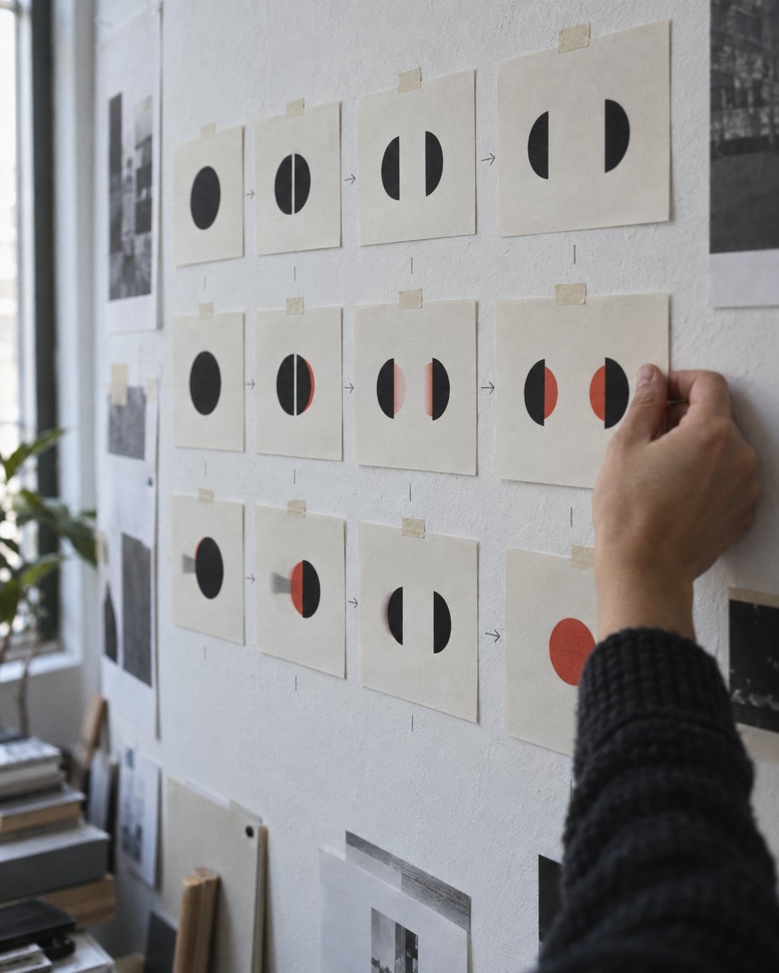
Our first motion step happens early, usually in week five of an identity project, when there are still two or three candidate marks on the wall. For each one we draw twelve key frames on A4 sheets: how it arrives, how it rests, how it hands over to something else and how it leaves. The sheets go up in a grid and read left to right, like a comic strip.
It is cheap work, pencil and marker for the most part, and it is the fastest way we know to kill a mark that only works standing still. A wordmark with eight separate letterforms can arrive in a hundred ways, and usually none of them feels inevitable. A mark built on a single gesture, a cut, a fold, a turn, almost animates itself. When the in-betweens are awkward to draw, the shape is telling you something.
Three verbs, not thirty
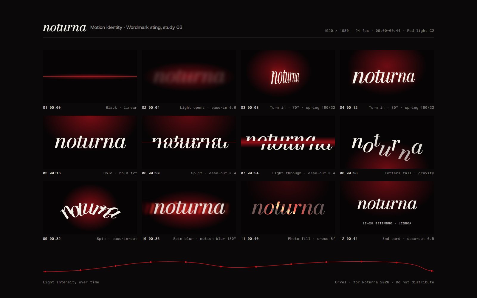
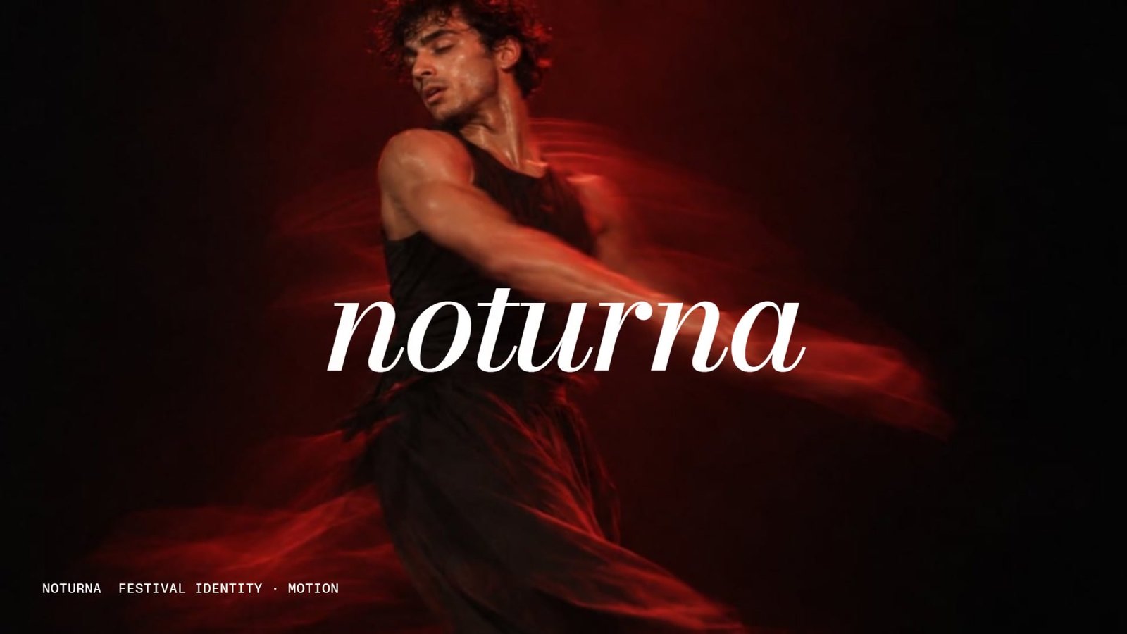
Every identity we make now has a short list of motion verbs, rarely more than three. For Noturna, the Lisbon dance festival, they were turn, lean and settle: the mark rotates on the axis of its italic, leans into the direction of travel and comes to rest a fraction late, like a dancer finishing a spin. For Kinro, a payments app, the verbs were arrive and land, because the whole brand is about money that turns up on time.
If a movement cannot be described in one word, it will be interpreted in twenty different ways.
The verbs matter more than any single animation, because they are what other people can carry on without us. An in-house editor cutting a thirty-second social clip does not need our After Effects file. They need to know that this brand turns and settles, and that it never bounces, wobbles or flies in from off screen.
Test it where it will live
A logo animation that looks lovely on a 27-inch monitor in the studio can be unreadable at 64 pixels on a three-year-old Android phone. So the second round of testing happens on the devices the brand will actually appear on. We build quick prototypes in the browser, put them on a shelf of test phones and watch them load on a throttled connection.
Three things fail more often than you would think. Fine strokes that shimmer during rotation, because they fall between pixels. Animations that take longer than the app takes to load, so the logo is still performing when the user wants to get on. And motion that ignores the reduced-motion setting, which a meaningful share of people switch on for good reasons, from vestibular disorders to simple preference.
Our rule of thumb for interfaces: the mark should resolve within 600 milliseconds and have a still alternative that says the same thing. If the identity only makes sense while it is moving, it is not robust enough to be a logo.
Write the rules down as numbers
Words like smooth, snappy and elegant mean something different to everyone. Our motion guidelines therefore lead with numbers: four durations, two easing curves, a maximum travel distance and a default delay between staggered elements. For Noturna that came down to a single page.
- Durations of 240, 480, 720 and 1,200 milliseconds, and nothing in between.
- One easing curve for arriving and one for leaving, supplied as cubic-bezier values for developers and as graph presets for editors.
- Never travel more than a quarter of the frame. The mark turns in place rather than flying across.
- A 40-millisecond stagger between letters, never more, so words still read as words.
Numbers can be checked. A developer can match them in CSS, an editor can match them on a timeline, and anyone can look at a finished piece and say whether it follows the system, without an argument about taste.
What changes for the client
Designing motion this early adds roughly a week to an identity project. What clients get back is a brand that behaves consistently in places they will never brief us on. Noturna’s volunteer team made more than two hundred social clips during the festival, and the identity still looked like one festival from the first poster to the closing-night screens.
It also changes the conversation at approval. Instead of choosing between drawings, the board chooses between behaviours. That is a better decision to be making, because it is closer to how people will actually meet the brand: in motion, on a small screen, for about a second.