




What we look for in a two‑week brand audit
Every screen, receipt and email a customer sees, printed and pinned to one wall. The gaps show up by the second afternoon.
 Freya LundStrategy Director, London
- Kind
- Process
- Published
- Reading
- 8 min

Before we design anything for a company that already exists, we spend two weeks looking at what it has already made. Not the brand book, which usually describes the brand as it was meant to be, but everything a customer actually sees: the website, the app, the checkout, the receipts, the delivery note, the out-of-office reply, the job adverts and the invoice template someone in finance built in 2019.
We print all of it, at actual size where we can, and pin it to one long wall in the Clerkenwell studio. For a growing company that is usually between 180 and 300 pieces. By the second afternoon, the gaps start to show.
Pin it up by journey, not by department
The most useful decision in an audit is how to arrange the wall. Companies naturally sort their material by who made it: marketing over here, product over there, customer service somewhere at the end. Customers do not experience it that way. They see an advert, then a landing page, then a sign-up form, then a welcome email, then a help article when something goes wrong.
So we pin everything in the order a customer meets it, along four or five real journeys we agree with the client in the first meeting. Buying for the first time. Coming back. Complaining. Leaving. Arranged like this, inconsistencies stop being a matter of opinion. You can stand at one end of the wall and watch the brand change its voice three times before the parcel arrives.
What we count
An audit can easily turn into a long list of complaints about fonts. To keep it useful we count a handful of things, the same way on every project, so the findings can be compared and tracked after launch.
- How many typefaces and weights are in active use, and where each one came from.
- How many versions of the primary colour exist. On one retail audit we found four different oranges, two of them introduced by the same agency.
- How many names the product goes by across the site, the app, support and sales.
- How many touchpoints were made without anyone from brand or design being involved.
- How long it takes, on each journey, before a customer reads a sentence that sounds like the company rather than like software.
The last measure is the most revealing. A company can have a precise, warm voice on its homepage and then hand every customer to a payment provider’s default emails, which is exactly where the money and the anxiety are.
The brand book describes the brand you meant to build. The wall shows the one your customers have met.
Twelve conversations
Alongside the wall, we hold eight to twelve interviews of about forty minutes each. Founders and senior leaders, naturally, but also the people who speak to customers every day: support agents, sales staff, whoever answers the phone. And four or five customers, recruited by the client, ideally including one who recently left.
We ask everyone the same opening question: how would you describe this company to a friend who had never heard of it? The answers are rarely the positioning statement. They are usually more specific, more human and more useful, and the distance between what the leadership says and what the support team says is often the brief in a single sentence.
Day ten: the readout
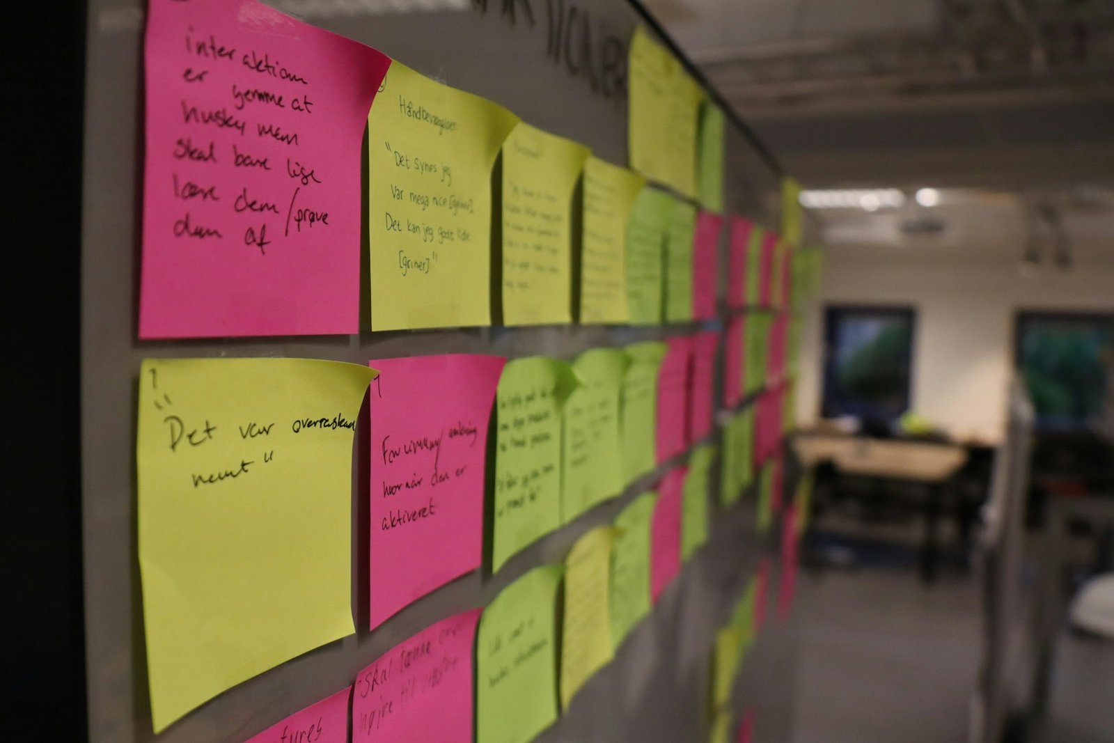
At the end of the second week we walk the client’s team along the wall, in person whenever we can. A photograph of a wall is a poor substitute for standing in front of three hundred pieces of your own company. Then we hand over three things.
- A written report of around twenty pages, with every finding linked to a photograph of the material it refers to.
- A ranked list of fixes, sorted into what to change this month, what belongs inside the larger project and what to leave alone.
- A one-page brief for the work that follows, which we both sign before any design starts.
Sometimes the answer is not a rebrand
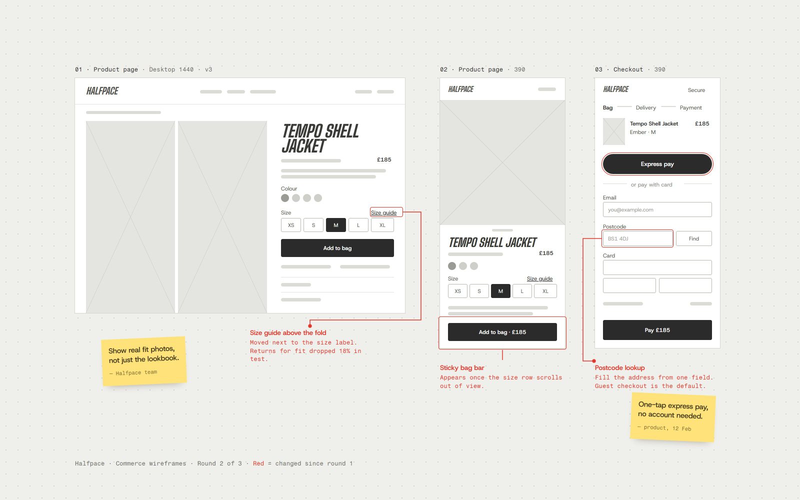
Roughly one audit in five ends with us recommending against the project the client came in for. The identity is sound; the problem is that nobody owns it, or that the product team cannot get at the assets, or that six freelancers are each working from a different PDF. Fixing that costs a fraction of a new identity and keeps the recognition a company has spent years building.
We would rather say so at the end of week two than discover it in week ten. It is also why we price the audit as a separate, fixed piece of work: the findings are useful whoever does the next stage, and they should be honest whether or not they lead to more work for us.