

Setting a festival in one typeface
Forty venues, nine nights and a single italic. What Noturna’s signage taught us about legibility at a run.
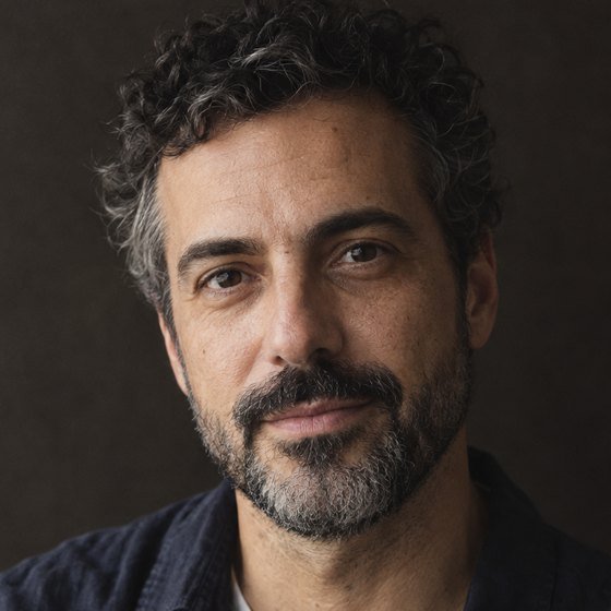 Tomás FerreiraDesign Director, Lisbon
- Kind
- Craft
- Published
- Reading
- 3 min
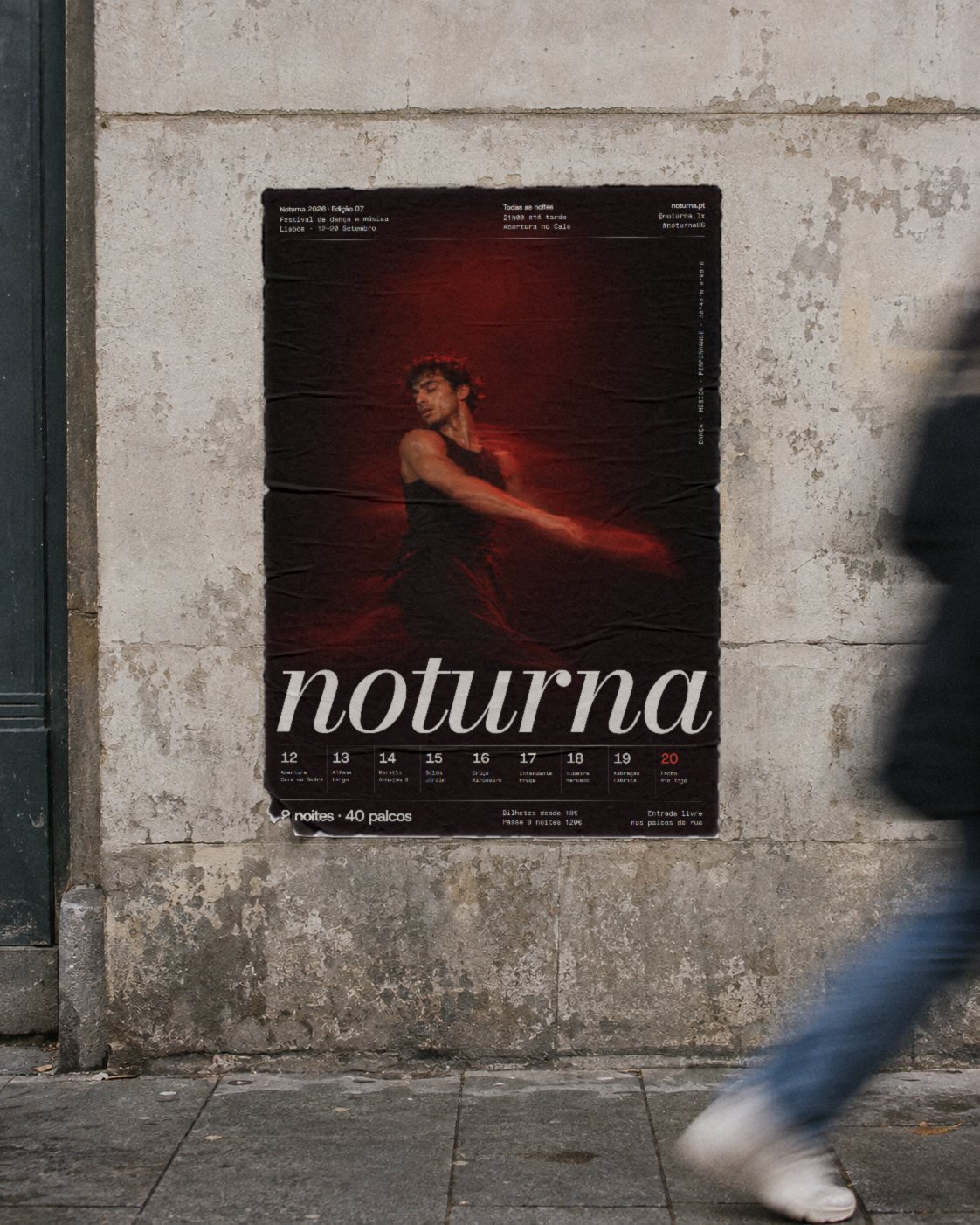
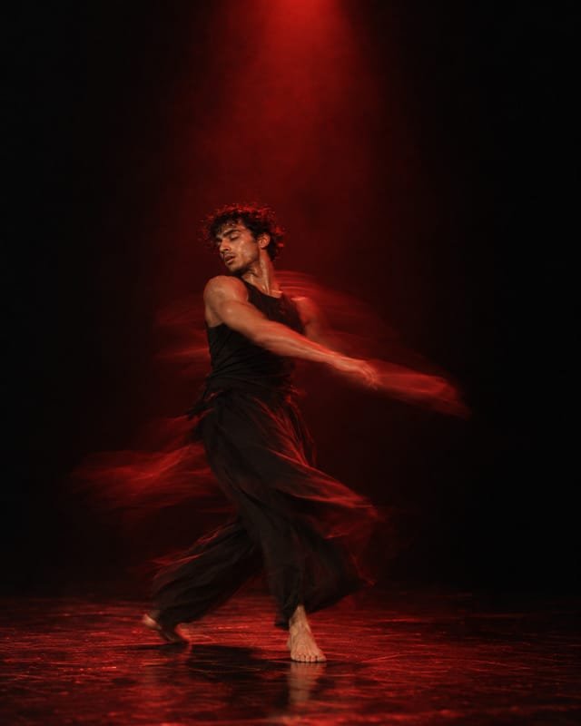
As I write this it is night six of Noturna, and the red flags are up on forty doors across Lisbon. Everything the festival prints this year, from the posters to the tickets to the arrows on the pavement in Marvila, is set in one typeface: a high-contrast italic in the Bodoni tradition, the same one that turns in the wordmark.
This was not the plan. For the first month we had a sensible pairing: the italic for display and a plain sans for everything functional, which is what most festival systems do and what I would have recommended to anyone else. We dropped the sans in week six, and the identity got better for it.
Why we dropped the second face
The pairing worked on posters. It fell apart on the street. Noturna’s audience moves between venues from midnight to four in the morning, quickly and usually in groups, and the signage has to say three things at once: this is Noturna, this is tonight’s venue, the next one is that way. With two typefaces the flags read as two messages. People stopped at the italic, recognised the festival and walked straight past the sans, which carried the information they needed. With one face, the recognition and the information were the same shape. You saw the italic and you were already reading the venue.
Two typefaces give a system somewhere to hide. One makes every decision visible.
Making an italic work at a run
A delicate italic is a strange choice for wayfinding, and we spent most of the project making it behave. The hairlines that look so good on a poster vanish at twenty metres under orange street lights. So we tested every sign size at the real distance, on the real streets, at the real hour, with four of us walking the routes between venues at two in the morning over three weekends.
- All signage uses the heaviest weight. The lighter weights are kept for print you hold in your hand.
- Venue names are never smaller than 140 millimetres on a flag, which holds to about thirty metres.
- The night numbers were redrawn slightly, opening the counters of the 6, 8 and 9 so they cannot close up at a distance.
- Tracking is opened by four per cent on every sign. It looks loose up close and correct from the end of a street.
The flags themselves are angled towards the next venue, so the lean of the italic and the lean of the flag point the same way. It is the detail people mention most, and it only works because there is one slant in the whole system.
What one face costs you
A single typeface takes hierarchy away from you and gives it back as discipline. Without a second face to signal a change of register, everything has to come from size, weight, colour and space. The programme was the hardest piece: 240 events across nine nights, in one italic, needed a strict grid and only three sizes to stay readable. We got there on the fourth draft. It also asks more of the people who use the system after us. The festival team builds most of its social posts itself, and with one face there is nowhere to hide a weak layout. We gave them twelve templates and one rule: nothing is ever set below 9 point in print or 16 pixels on screen.
I would not recommend one typeface for a product with dense tables, a long legal document or anything that has to be read for an hour. Noturna is read for seconds at a time, in motion, at night. For that, one strong voice turned out to be clearer than two polite ones, and the festival sold out a week before it opened.